


I know that pink is not necessarily a colour that everybody loves using around the house. There is a bit of a connotation around this colour. It has been associated to femininity and childhood through many cultures and countries, however it has also been associated with sophistication in many countries.
In Western cultures, for example, it has often been associated with femininity, romance and love but this is fairly recent. Historically pink was not always a feminine colour and in the early 20th century it was considered an appropriate colour for boys due to its closeness to red, a strong and decisive colour.
In the Middle Eastern cultures, pink can signify wealth and status. It is often used in intricate designs and patterns in textile and architecture adding a touch of elegance and luxury.
In Latin America, pink can carry various meanings depending on the context. It is often used in festivities and celebrations and can symbolise happiness and joy in some cultures, it is also linked with religious iconography and traditions.
These are just some example of the different significations of this colour across the world and across cultures.
If you want to start using this colour in your home but want to make sure that your house doesn’t look like a Candyland but would like more of a sophisticated and elegant look then keep on reading and you will find some rules that can help you to get it right.
A bit of theory first
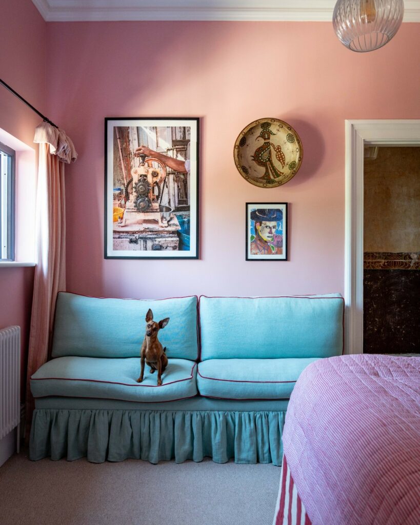
Pink in home decor can create a warm and inviting atmosphere, and it is often associated with feelings of nurturing and love but different shades of pink can evoke various emotions.
Soft, muted pinks tend to have a calming and soothing effect, making them ideal for bedrooms and relaxation areas. In contrast, vibrant, bold pinks can add energy and a sense of fun, suitable for creative spaces or areas meant for lively interactions.
When using pink in your home decor, balance and harmony are crucial.
Pairing pink with neutral tones and natural materials can prevent the space from feeling overwhelming or overly reminiscent of a “Barbie house.”
By thoughtfully selecting and combining pink with other colours and elements, you can create a space that is both aesthetically pleasing and emotionally comforting.
The spectrum of pink shades is vast and varied, each bringing its own unique personality and mood to a space.
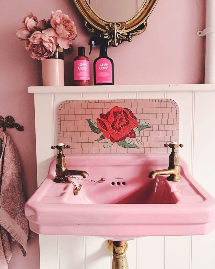
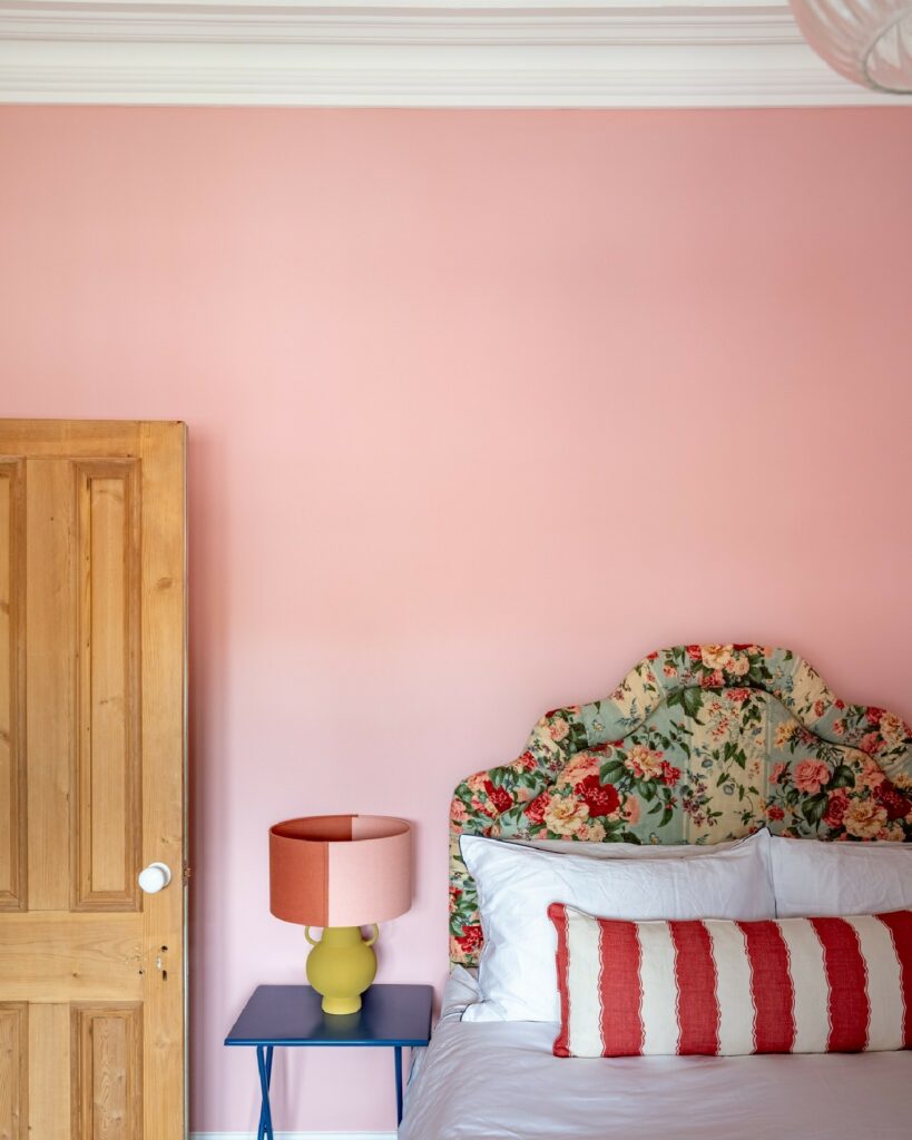
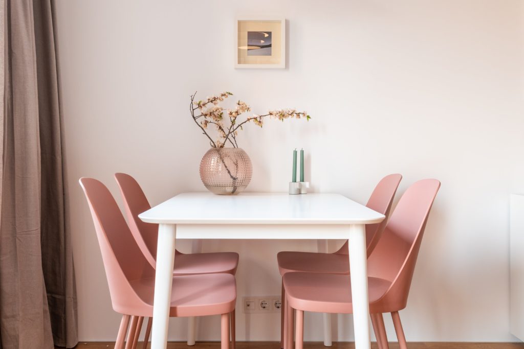
Soft, pastel pinks, such as blush or baby pink, create a calming and soothing atmosphere, making them perfect for bedrooms or nurseries. These lighter shades are often associated with tenderness and tranquility.
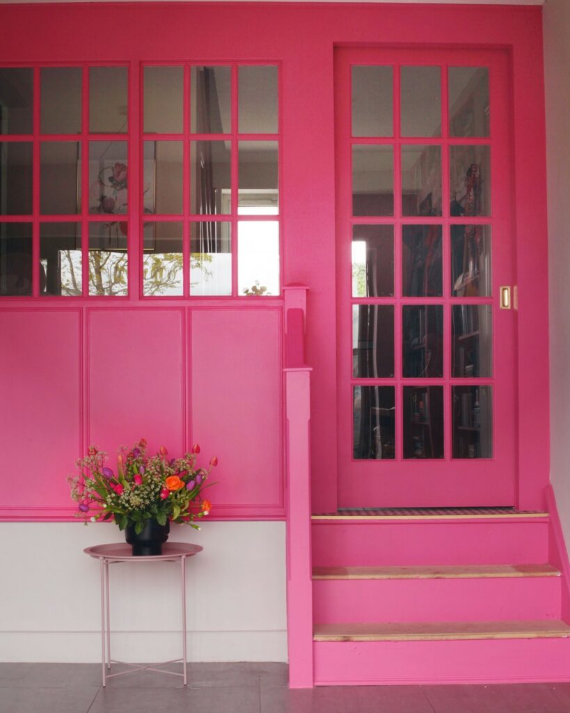
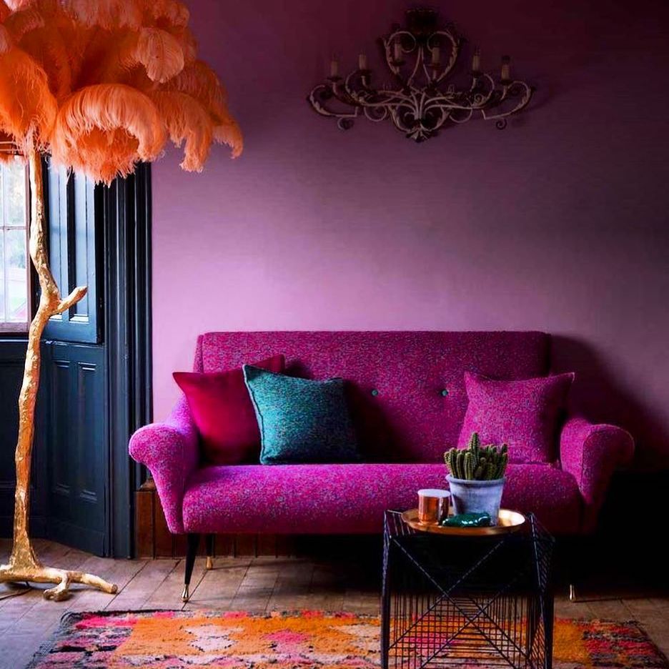
On the other end of the spectrum, vibrant pinks like fuchsia or magenta are bold and energetic, infusing spaces with a lively and playful vibe. These brighter shades can be used to make a statement in living rooms or creative areas.
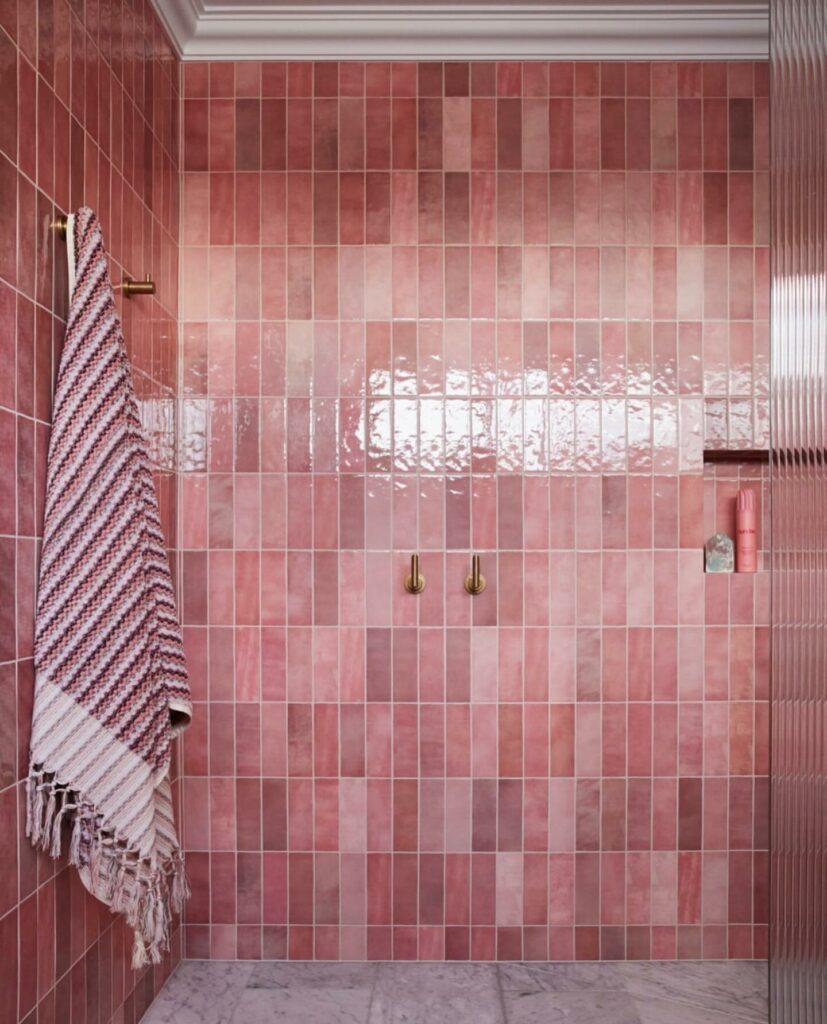
Dusty pinks and rose shades fall somewhere in between, offering a sophisticated and elegant touch that works well in both modern and traditional settings.
Each shade of pink can transform a room, from creating a serene retreat to a dynamic focal point, depending on how it is used and paired with other colors and elements.
Baby Pink
Baby pink in home decor exudes a soft, gentle, and calming ambiance, making it an ideal choice for creating serene and nurturing spaces.


Blush
Blush is a warm, pale pink with a touch of peach or beige undertones, giving it a gentle and elegant feel.

Dusty Pink
Dusty Pink is a muted and subdued version of traditional pink. It has a slightly muted or faded quality, often described as a soft, powdery pink. This color is more restrained and can have a vintage or antique aesthetic.

Magenta and Fuchsia
Magenta is a strong and saturated pink-red color. It is a pure, vivid shade with equal parts of red and blue. Magenta is often associated with intensity and warmth. While fuchsia has a purplish tint, magenta tends to be a more straightforward blend of red and blue, creating a rich and bold hue.
Fuchsia is a bright and intense pink color with a purplish undertone. It is named after the fuchsia plant’s vivid flowers. Fuchsia is lively and eye-catching, often described as a deep and electric pink. It falls on the cooler side of the pink spectrum, leaning towards purple.


0 Comments