


Are you fed up with beige, grey, or white backgrounds in your home? I understand, even though it’s a relatively safe option, it can lack character.
It’s hard to hide that colours are my passion and for me, a house without vibrant accents throughout the rooms is a bit like french fries without salt and ketchup—it’s missing something, and sometimes we just can’t put our finger on it.
So, where do we start when we’re not used to playing with colours, are afraid of making mistakes, and are overwhelmed by the vast and varied choices that exist in the world of colour?
Understanding the basics of colour is essential for anyone interested in decoration, design, or art.
However, it’s common to feel a certain apprehension at the idea of integrating bright or unusual colours.
For some, this exercise is instinctive, while for others who are more rational, it becomes more difficult; they struggle to trust themselves when it comes to choices, and for the latter, referring to the theory of the colour wheel becomes an essential support.
Colours Basic principles
A glance at the colour wheel
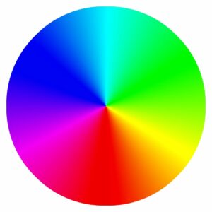
The theory of the colour wheel is an essential tool that helps to understand and apply the relationships between colours.
It is based on the primary colours—red, yellow, and blue—which are the foundation of all other colours.
By mixing them in different ways, we get the secondary colours: orange (red + yellow), green (yellow + blue), and purple (blue + red).
Furthermore, by combining a primary colour with an adjacent secondary colour, we create tertiary colours, which further enrich the available colour palette.
The wheel makes it easy to visualise complementary colours, which are directly opposite each other on the wheel and, when combined in decor, they enhance each other, creating a vibrant visual effect.
A quick word on Colour Psychology
Warm colours like red, orange, and yellow can evoke feelings of warmth and dynamism, while cool colours like blue, green, and purple tend to bring calm and serenity.
This knowledge is not just theoretical; it is extremely practical for creating spaces that intentionally influence mood and perception.
The judicious use of colour can truly transform an ordinary space into a vibrant and welcoming place or establish a calming atmosphere as needed.
How to Incorporate Colour Gently
It goes without saying that if your decor is predominantly made up of neutral colours, such as beige, grey, white, and natural colours, it may be difficult to visualise colourful walls and painted ceilings. In these cases, it is always recommended to start with small touches scattered throughout your rooms.
But before all that, it’s important to discover and/or understand which colours attract you and create a sense of joy and serenity for you. Although each colour affects our emotions and moods, we are not all drawn to the same palette, and it’s important to discover the one that resonates with you.
Discover Your Colour Palette
Here is a simple exercise to help you discover the colours that attract you the most.
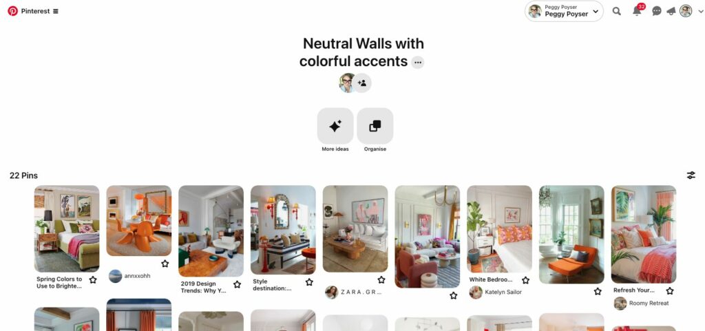
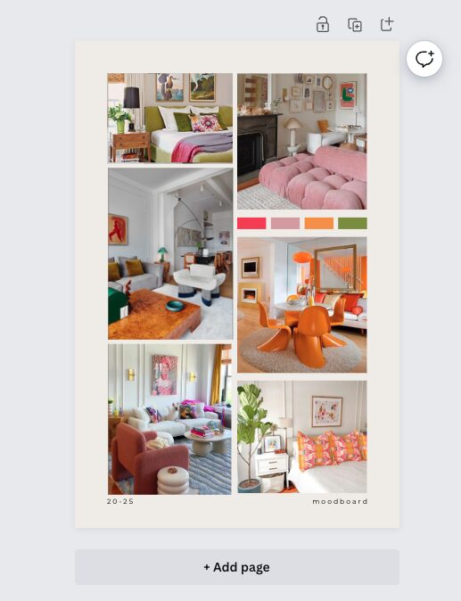
→ FIND IMAGES that inspire you
A quick and easy way to do this is to start by visiting Pinterest and look for images of decoration, accessories, and furnishings, and without overthinking, save everything that instinctively attracts you to a board. Don’t try to understand, just trust yourself.
→ LOOK FOR THE COMMON DENOMINATOR
Once this is done, view all these photos and look for common denominators. Don’t hesitate to rearrange your photos so that the same colours are grouped together.
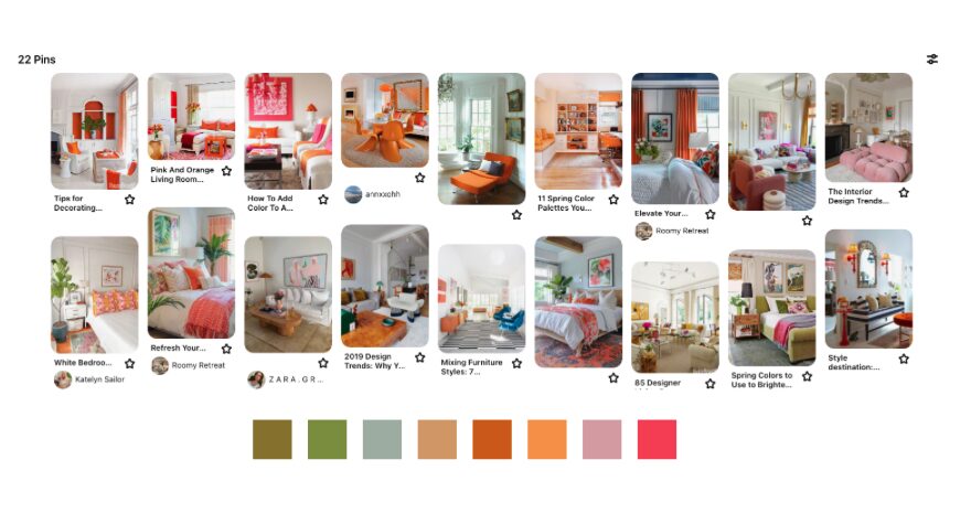
Are the colours that attract you the most vivid and saturated, or are they more in a pastel range? Are there several colours that appear regularly? Do all these colours vary depending on the rooms? For example, do you prefer kitchens more or less all the same colour, and are these colours different from the ones you like in a bedroom?
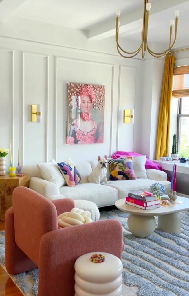
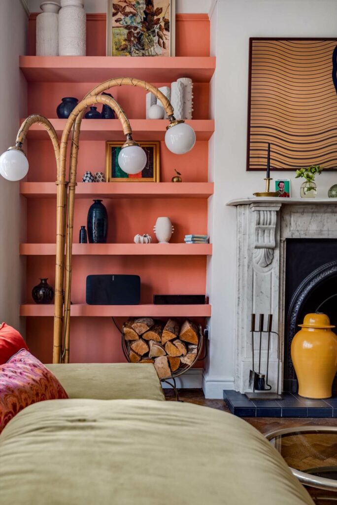
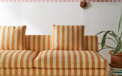
For instance, if we base it on the example I’ve been using here, we see that the colours that frequently stand out are shades of orange and bright pink.

→ pair YOUR FAVOURITE COLOURS
Once you have identified several colours, take the exercise a bit further and look at the most frequent colour combinations in your saved photos. For example, you might notice that orange shades, soft pink, and green often pair perfectly together.
This approach allows you to identify two or three colours that complement each other, which you can incorporate into your décor with minimal risk of clashing.
Still based on my example, you can see that by taking three different colours—bright pink, soft pink, and orange—I can pair them with all the other colours that are part of my original palette, and they all match well together.
This means that if I use these five colours throughout my décor, I can achieve a harmonious decor without overwhelming the overall ambiance.
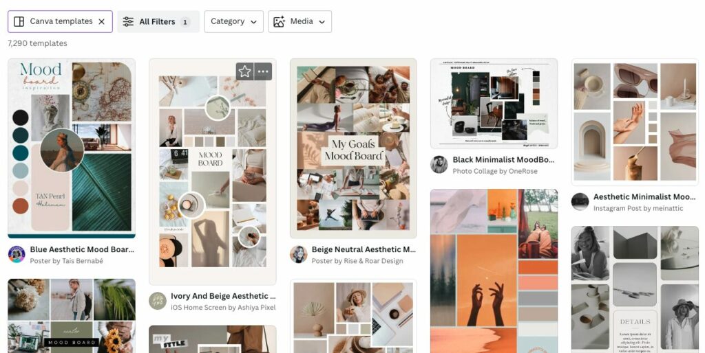
→ CREATE A MOOD BOARD AS YOUR REFERENCE
Once you have determined all the colours you like and their complementary colours, it will be time to create a mood board.
This will serve as a reference for your decoration and help you focus on these colours without getting distracted.
A simple and effective way to create this board is to use Canva, a free application with pre-designed templates that you can easily customise.
When you ready to decorate, Start with Small Changes
Once you have established a colour palette, it’s time to begin with small changes throughout the house.
Add cushions, vases, and colourful artworks that can introduce vibrant shades without a permanent commitment.
If you decide to paint walls, then start with light touches or for limited areas such as an alcove, for example.
Finally, don’t underestimate the role of lighting in the perception of colours: abundant natural light will bring out the true colours, while softer artificial lighting can alter how colours are perceived, making them appear warmer or cooler.
Common Pitfalls and How to Avoid Them
One of the most common pitfalls is the lack of consistency among all chosen colours, which can make the space look cluttered or incoherent.
Another frequent mistake is using too many bright colours without balancing them with neutrals, or choosing shades that clash rather than complement the overall ambiance of the house.
To avoid this, it is advisable to select a base colour palette for the entire house and adapt it slightly according to each room to maintain visual harmony. This is where a mood board becomes useful, helping you stay true to your original choices.
Finally, if you want to gather more inspiration for how to beautifully integrate colours in a safe way visit my pinterest board below.
Good luck and remember, trust yourself and your instinct. Your home should be the place you love.


0 Comments